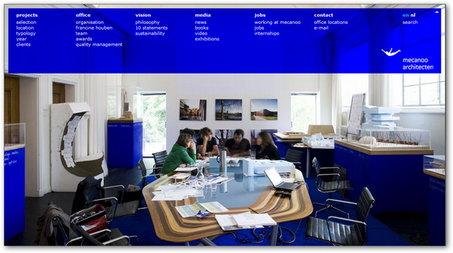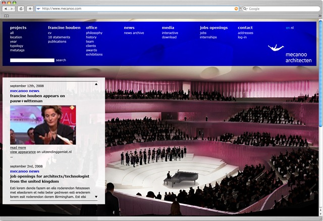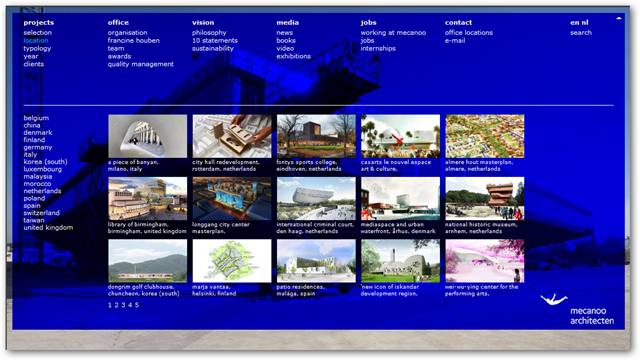
Last Tuesday the new website of Mecanoo architecten BV went live. Mecanoo is one of Holland’s leading architecture firms with over 50 employees handling projects around the globe. They were founded in the 80s by a group of students from the Delft University of Technology architecture school (the same that I attended, incidentally) and are firmly rooted in its modernist heritage. They have produced a string of landmark buildings and they’re continuously flooded by intern requests from around the world. Walking the corridors of this company always feels like its a global village, even though you’re in the heart of Delft, old traditional Holland at its best. I consider it a privilege to have worked with them for many years now. In fact, I did much of my research at university in collaboration with them, so Mecanoo and I go back quite some time.
Background: the Mecanoo Intranet
So how did we arrive at this solution? At this point it is important to note that my involvement with them had been primarily building their intranet up to this point. Because Mecanoo is highly dynamic in terms of personnel with many foreign exchange students/interns and collaborators (for foreign projects), they realized they needed an intranet that was very malleable. As a DotNetNuke adept I hooked them on the ‘Lego’ concept of this platform. I.e. you get the base plate and you keep filling in and changing as your needs change. This has been a success for them. The intranet does not need to be taken down for revisions, it just keeps getting adjusted and organically grows with them.
Central in the Intranet site is the project database. This runs off a custom module that manages an ever growing/changing table of data. From the outset it was clear they were not going to be able to specify what data fields were going to be relevant over time for any given project, so the module is set up to allow a continuous adjustment of this. Adding a new field is a matter of an hours work. As the database grows it becomes more and more the core of the organization (from a data perspective naturally). More and more satellite tables are getting hooked up to it (awards, publications, etc). One central goal in this effort is that for people entering the organization it should be easy to find information about past projects. This hooked into my former occupation as Knowledge Management researcher. Not only does it give core info like participants, location, building technologies, etc. Crucially it also shows who was involved so you can quickly find out “who to ask” if you have any questions about the project.
A second goal of the project database was to gather all data that was floating around in spreadsheets and other documents about projects. It’s important to realize that in an organization of this size people start to work past one another and the tech savvy employees create their own little database apps. This gathering is a continuous task. One should not have the illusion that this is a one off thing. Data nuggest keep getting created/found and over time will be integrated. The underlying, driving principle though is that one must avoid data duplication. I.e. the same data being entered multiple times in different places. This leads to (1) annoyance among employees who’d rather focus on core tasks, and (2) confusion as inevitably differences occur.
Website requirements
As their “Intranet guy” I sat in on a preliminary meeting to establish criteria. My primary focus was on battling data duplication. In their previous website all data had to be duplicated from within the organization. Now that the Intranet had become “leading” in many respects, there was growing frustration that on the “outside” projects sometimes displayed antiquated information. So as an engineer I tried to abstract my position as “data manager” and keep them to this bottom line.
A second criterion, albeit less important at this point, was (another hobby horse): Keep things flexible. If you cast things in concrete, you will probably end up with high investments when you want to change something. Better invest a little more at first to have it set up so it is easy to maintain and expand.
Other requirements that are notable were: good SEO implementation, good compliancy, etc. As a result of these we quickly made the technical decision to demand no Flash be used.
Design
The design was done by the firm responsible for a comprehensive overhaul of their house style: Solar. They are not a web site shop, so the design would need to implemented by someone else. At this point I decided to team up with my good DNN buddy Timo Breumelhof and we made a bid for the project to be based on DNN. From the outset it was clear the design was not really friendly to a CMS or even HTML based implementation, but if anyone could do it, I figured it’d be Timo. The division of labor was to be: Timo does all things skin related, I take care of technical/programmatic aspects. We got the contract (their own IT had also expressed a preference to keep working with the same CMS as they were used to for their intranet, so that helped).
With the material we received it was clear the designer had mostly designed for Flash based websites. The first challenge was the background image. The designer had designed for a specific resolution, but no one had given much thought to what happened on different resolutions and (more importantly) different aspect ratios. The idea was a screen filling background image, but there are many reasons why you should not go there (for one I find it incredibly rude if a website decides to resize my browser).

The curtain drop animation proved to be challenge nr 2 (but quickly negotiated by Timo). More serious was something that cropped up soon after: the blue overlay over the background image was not a transparent layer, but was a layer multiplication (the designer used Photoshop to prepare all images). Probably unknown to the designer, this is not possible in straight (cross browser compatible) HTML. The only way this could be done was to have images pre-prepared in their different formats: with blue overlay and without. Image management became a major component as we’ll see later.
Image Management
One of Mecanoo’s pillars is its attention to detail. This includes photos and images of their work. From the very beginning the person responsible for image management was involved in this project. It quickly became clear she was going to need specific tools for her needs. The basis was a Document Exchange to hold all the jpgs that she uploaded. Using DMX meant she could just drop in a jpg using Windows Explorer (using WebDAV) and it would be online. The rest was up to custom additions for image processing. An image handler was created where the image could be requested together with all relevant parameters. This means there is a total automatic image flow throughout the application. This is used for the background images on all pages as well as the thumbnails and other images on site.
Project Data
Because we opted for the same technology as the Intranet we could reuse components for the rendering of projects. Every so often data is refreshed from the intranet to the website. The website is mostly driven by the aforementioned module. It creates a copy of data as XML and this is manipulated over and over again to create all the lists and detail vies you see. Adding a new way of sorting and entering data becomes trivial. Currently we have a projects data view sorted by client types, years, typology, location and finally a “top 15”. If a new page needs to be added it is fairly easy to do now.

Static texts and ML
As any website this one, too, has many pages with static text. This has been done using Erik van Ballegoij’s ML solution. This localizes (i.e. makes language dependent) the page titles and the static text boxes you see. The project data rendering module is ML capable in itself, so it didn’t need any other tools for this.
News Items: the Blog module overhaul
To handle news items from the organization we looked at many existing solution but they just didn’t fit the bill. The module would need to be ML aware. The module would need to handle a picture to go with it (and also to be used as background image in the skin). The module would need WLW support to make sure the PR department could work with a Word like interface and could just drag and drop images. The module would need to be able to categorize so we could split the data at a later date. Ideally the module would also allow passing data from the intranet to the website. The content was going to be regular news items produced by PR as well as columns, lectures, presentations etc made by employees (at first just the director, but at a alter date also other employees that have a public role).
Long story short: the closest fit was still the DNN blog module. I contacted the Blog module team lead and fellow DNN core team member Antonio Chagoury to ask where they stood. He told me they were working on categorization and tagging as we were speaking. I offered to lend a hand as I needed to make progress on the project (Timo stepped in to iron out XHTML issues in the module). So in delivering a solution to Mecanoo the community now has its Blog module v 04.00.00. It was very rewarding to be able to kill two birds with one stone (although I’d never kill a bird of course). Although we did not achieve full ML, we now mimic it by leveraging categorization. We have a category for every language and we can draw out data accordingly.
A final component in this solution was a cross posting module. This little gadget sits on a blog module page and allows the PR team to push a blog post from the intranet to the website. It does fork the content (violating my base principle) but this turned out to be the best solution. The final news items are reprocessed into XML and rendered through the same engine that renders projects.
Finally
The result is something all involved should be deeply proud of. So here are the main protagonists:
- Mecanoo (Marijke Gantvoort, Projectleiding; Sjoerd Redel, ICT; Ayla Ryan, Hanneke Hollander, Machteld Schoep: PR-collaboration) http://www.mecanoo.nl: client, project management, artistic direction, content
- Solar (Tim Vermeulen) http://www.solar.nl/: design
- Timo Design (Timo Breumelhof) http://www.timo-design.nl/: implementation of design, skinning, Javascript guru
- Bring2mind (Peter Donker) http://www.bring2mind.net: technical implementation, programming
In all this project reminded me of architecture school as different parties, with different perspectives, collaborate toward a common goal. I hope this post and website illustrate how far you can take DotNetNuke, what you can do with DMX, and the skinning skills of Timo. I want to thank all involved for their hard work and patience and just being nice to work with.